Please use the screenshot below to organize your files for review.
Thursday, December 12, 2013

Monday, December 2, 2013
Week 6
Shape tool
Here's a great tutorial for creating selections using the pen tool and paths:
http://www.photoshopessentials.com/basics/selections/pen-tool-selections/
Pen Tool
What is a path?
The shape tool allows you to draw many shapes based on
vectors, rather than pixels. You can change the color using fill in the options
bar, or just click on the thumbnail of the layer in the layers palette.
Here's a great tutorial for creating selections using the pen tool and paths:
http://www.photoshopessentials.com/basics/selections/pen-tool-selections/
Pen Tool
A path is a line that goes from one point to another, not based
on pixels. It can be thought of as an outline that you can use to fill, create
selections, masks, or apply a stroke.
Keep an eye out for the two path modes
The options bar shows two pen modes, fill pixels icon (like
shapes/not the one we want) and the Paths icon/the one we want.
Straight paths
Start by creating a shape clicking and letting go, then
clicking again to create another anchor point to make straight lines. Close and save the path. Turn the path into a selection/marching ants. If you
don’t save it, it may disappear when you create a new path.
Curves…
Ah, but there are curves in life you say.
Direction handles: Click, drag out a handle towards the
direction you want your path to go. The point in the middle is the anchor
(square shape), the points on either end are direction handles (circle shape.)
They control the angle and length of the curve. One handle controls the curve
going OUT of the point and one, controls the curve going IN to a point.
You can always go back and fix an anchor point if you don’t
get it right the first time, which is great and makes the pen tool a very forgiving tool indeed!
Rotate and Resize
Rotate and Resize direction handles by holding down command
to get the direct selection tool. Click on the end and rotate like a see-saw,
which adjusts the angle of the curve. Drag the handle in and out to adjust the
length of the curve.
Convert Point
To rotate each handle independently, hold down alt to get the
convert point tool.
Now, the opposite handle does not move. (Can release the alt
button, once you start dragging.)
Drawing a curve
Hold down shift to constrain your movement.
Twists in the path may mean that you’re dragging the wrong way and the path is
crossing itself.
Use Ctrl+Z or delete to delete the marked anchors.
Remember that you can add and subtract anchor points.
Srs bzns
Always start by examining an image for a good place to start
and get a general idea of where you might set anchor points. When dealing with curvy
selections, often fewer anchor points mean cleaner paths. It’s not a staple
gun. You can check a selection by creating a bright colored solid layer beneath it.
Here's a great tutorial for creating selections using the pen tool and paths:
http://www.photoshopessentials.com/basics/selections/pen-tool-selections/
Here's a great tutorial for creating selections using the pen tool and paths:
http://www.photoshopessentials.com/basics/selections/pen-tool-selections/
Homework
Be prepared to show your final collage image.
Isolate the rhinocerus and praying mantis from their background using the pen tool.
Come in with a concept and sketch for a static banner ad for a product of your choice that you will be making for 300x250/72 PPI, 160x600/72 PPI, and 728x90/72 PPI. This should include a logo and CTA (call to action which will most likely take the form of a button of some sort.)
Please see http://www.bannerblog.com.au/ for inspiration.
Friday, November 8, 2013
Week 5...Introduction to Selections
Creating Selections
We
often see the world as many separate objects, while Photoshop only sees
it as colored pixels. We need a way to work on these pixels here, but
not those pixels there. Creating selections is how we tell Photoshop
which pixels we want to work on.
Here's a useful article explaining why creating selections is important.
Below you'll find a list of the selection methods we looked at in class and tutorials to help explain them further.
Rectangular and elliptical marquee tool
Lasso and polygonal tool
Color Range
Magic Wand
Free Transform Tool
Please see this tutorial to review the free transform tool.
Please save the paths used in your PSD under the Paths tab.
Here's a useful article explaining why creating selections is important.
Below you'll find a list of the selection methods we looked at in class and tutorials to help explain them further.
Rectangular and elliptical marquee tool
Lasso and polygonal tool
Color Range
Magic Wand
Free Transform Tool
Please see this tutorial to review the free transform tool.
Homework
Make isolated selections of all items photographed on a separate layer. Include a contrasting solid color layer below it in the PSD.Please save the paths used in your PSD under the Paths tab.
Monday, November 4, 2013
Week 4...Layer Essentials and Adjustment Layers
Layers
Understanding and organizing layers is integral for controlling and creating great images and Photoshop files.
You'll find some good links that go into detail on layers, how they work, how to organize them, etc. below.
Adobe:
http://help.adobe.com/en_US/photoshop/cs/using/WSfd1234e1c4b69f30ea53e41001031ab64-78e3a.html
Photoshop Essentials:
http://www.photoshopessentials.com/basics/layers/layers-panel/
Scavenger Hunt Chopshop
Think about the final image you create—story, composition, how it will all come together. You can use themes from fantasy, travel, holidays, stories, etc. I recommend creating a sketch of what your final composition will look like.
Understanding and organizing layers is integral for controlling and creating great images and Photoshop files.
- Create new blank layer: shift+command+n
- Create layer with selection: command+j
- Duplicate layer or layer group: command+j or drag
- Naming and re-naming Layers: double click layer name
- Select pixels in a layer: command+click thumbnail, select whole layer (marching ants!)
- Auto-select option: check box on option bar of move tool
- Right click on your canvas to open a popup window with layer names to select layers
- Restack layers by clicking and dragging
- Create layer groups: command+g
- Delete layers and layer groups: highlight layer you want to delete and use delete key or drag to trash icon in lower right of layers pallette
- Delete groups and choose to delete just the group or the group and its contents
- Repositioning layer content with the move tool: v
- Align layer content: select move tool to bring up align options in the option bar
- Change layer Opacity by either dragging the slider or input numbers
- Use lock options: transparency, image pixels, location, all
- Choose Layer panel options: color code, thumbnail size, doc or content bound
- Layer Filters: pixels, adjustments, type, shape, smart objects—on/off in upper right corner
- Merge layers: merge layers command+e, merge all visible, flatten image
- Visual/hidden: eye icon to the left of the layer thumbnail
- Don't forget about layer options like controlling your thumbnail size, color options, and naming
You'll find some good links that go into detail on layers, how they work, how to organize them, etc. below.
Adobe:
http://help.adobe.com/en_US/photoshop/cs/using/WSfd1234e1c4b69f30ea53e41001031ab64-78e3a.html
Photoshop Essentials:
http://www.photoshopessentials.com/basics/layers/layers-panel/
Adjustment layers
Adjustment layers are superior to simply making adjustments to pixel layers, because they are less destructive, editable, and more flexible.
You can find adjustment layers as the half circle icon at bottom of layers panel, as a dropdown in the main toolbar under layers, or in the adjustment panel under window.
You can find adjustment layers as the half circle icon at bottom of layers panel, as a dropdown in the main toolbar under layers, or in the adjustment panel under window.
Clipping Mask affects only layer beneath it, no clipping mask affects ALL layers beneath the adjustment layer.
- Brightness/Contrast
- Levels
- Curves (highlights top, shadows bottom, eye droppers)
- Exposure
- Vibrance
- Hue/Saturation
- Color Balance
- Black & White
- Photo Filter
- Invert
- Posterize
- Threshold (black/white, high contrast clipping)
Please learn more about adjustment layers on Photoshop Essentials here.
Homework
Scavenger Hunt Chopshop
Think about the final image you create—story, composition, how it will all come together. You can use themes from fantasy, travel, holidays, stories, etc. I recommend creating a sketch of what your final composition will look like.
Please see examples here. Note that I have named the photographic elements that I believe were used, in the comments of each. This is to help give you an idea of what to photograph to be able to create your final image. Please be aware that we will not be altering the elements much. We will be isolating, transforming, cutting, and adjusting. The point here is to think more in terms of collage, rather than stretching, distorting, painting, etc. I took care to only include images on the Pinterest board that in truth, I believe that you could create by the 3rd week of the assignment, that reflect what I am looking for.
For example, in the below image, the photographic elements appear to be a fish, a sitting child, a branch or fishing pole, water (possibly from an aquarium), and a sky.
Take a minimum of 5 pictures
and use Camera RAW plugin to process your photographs and Photoshop adjustment layers to
perfection.
For example, in the below image, the photographic elements appear to be a fish, a sitting child, a branch or fishing pole, water (possibly from an aquarium), and a sky.
 |
| Photo by Caras Ionut |
Friday, October 25, 2013
Week 3...RAW Photoshop Plugin and Workspaces
RAW images and Camera RAW plugin
Why use camera RAW images?
· Powerful
correction tools
· Edits saved
as “instructions” files
· Less
destructive edits, less data loss than in Photoshop
· 16 bits per
channel, more original data (JPG and TIFF is 8 bit)
· More tonal
range/tonal distribution, less data in the light/white range, more mid and
shadow tones
· Superior
Noise Reduction and Sharpening is easier to use and causes less data loss
· Understanding
and using Camera RAW will help to understand Photoshop, similar features for
tonal control, color correction, etc.
Check that preferences in Photoshop are checked for opening
RAW images in RAW plugin:
Photoshop>Preferences>File Handling>Prefer Adobe Camera Raw for Supported Raw Files
The RAW photo I used for the in-class demonstration can be found here: http://www.elinoreeaton.com/storage/IMG_1581.CR2
RAW screen tools
· Histogram
· Original
camera settings and information
· Adjustment
Tabs
· Toolbox
· Camera
Model (at top or bottom of screen)
Click lower link to show workspace, recommend
Adobe RGB to manage colors for both RAW and Photoshop.
Tabs
Use presets to best describe lighting for which
the photo was taken. (note: presets can only be used with RAW images.)
Temperature: raise and lower to add blues/make
cooler or add yellows/make warmer
Tint: left and right to add greens or magentas
Histogram shows values of red, green, and blue
areas; white is where they overlap
Shadow clipping left (absolute black),
Highlight clipping right (absolute white.) You can tell how dark or light a picture is without even seeing the actual image due to the nature of the histogram.
One of the goals to consider is to redistribute the tonal values in the
histogram.
Basic Tab
· Adjust
Exposure and Contrast for overall tonal values.
· Adjust
Highlights and Shadow to bring back details of highlights and shadows
· Adjust
Whites and Blacks to brighten whites (image detergent) and darken blacks (image
ink.) Clipping warnings can be helpful here to see where exactly they are, and
keep an eye on the histogram.
· Increase
Clarity to adjust edge values or deliberately make the picture softer by
decreasing (hint: low clarity…fabulous glamour shot; high clarity… there’s your
edgy movie poster.)
· Vibrance to
adjust saturation, is preferred because it protects skin tones and is less
likely to oversaturate.
Tone Curves
Detail
Zoom to 100% (use hand tool/spacebar to look at other
sections)
~50-60 for most photos
~100 for very sharp objects and scenes, like
buildings
~1.0 to 1.3 for radius, how many pixels
surrounding an edge are modified
Reduce noise with Luminance slider, ~20-70 and
watch the noise disappear!
Adjust color to help solid color “speckled”
areas try ~40-50
This may reduce color values, readjust with
Color detail to ~75
HSL/Grayscale
Use to adjust each hue individually
Adjustment brush to
Split toning
Great for adjusting the tone of a highlighted
area
One method for creating mono or duo chromatic images is:
Convert to Grayscale (HSL/Grayscale tab)
Move both Saturation sliders halfway to judge
colors for next step.
Move the highlights hue slider to change the
color of the highlights and the shadows hue slider to change the color of the
shadows.
Reduce balance setting of shadows and increase
balance setting of highlights
Workspace
Understanding your workspace, how layers work, and how to create great selections is an integral part of Photoshop.
Here is an Adobe link detailing workspace basics:
http://help.adobe.com/en_US/photoshop/cs/using/WSfd1234e1c4b69f30ea53e41001031ab64-750ca.html
Workspace
Understanding your workspace, how layers work, and how to create great selections is an integral part of Photoshop.
Here is an Adobe link detailing workspace basics:
http://help.adobe.com/en_US/photoshop/cs/using/WSfd1234e1c4b69f30ea53e41001031ab64-750ca.html
Homework
Create a still life and photograph it. Create 9 versions of your picture using RAW plugin and the rainbow as your guide.
Color perfect
Red
Orange
Yellow
Green
Blue
Violet
Black
White
Please use different techniques for each color! Make some monochromatic, use brightness, individual color adjustments, etc. but most importantly, make your color perfect version, color perfect!)
Save each as a DNG file in one folder.
Save each as a DNG file in one folder.
Crop each one differentlly using Photoshop and save as PSDs in one folder.
I've included some images for inspiration here.
Adicolor
Take a look at a very creative ad campaign based on different interpretations of color, albeit a bit disturbing at times:
http://thisisnotadvertising.wordpress.com/2012/10/24/adidas-adicolor-project-united-colors-of-adidas/
Blue = r023g075b158.net
Yellow = r254g245b006.net
Green = r006g146b071.net
Pink = r243g197b208.net
Black = r000g000b000.net
I've included some images for inspiration here.
Adicolor
Take a look at a very creative ad campaign based on different interpretations of color, albeit a bit disturbing at times:
http://thisisnotadvertising.wordpress.com/2012/10/24/adidas-adicolor-project-united-colors-of-adidas/
The original site doesn't seem to work anymore unfortunately, but to promote the films, they registered
domains for each color-themed film based on their RGB
color values. Here’s the full series of seven films:
White = r255g255b255.net
Red = r213g037b053.netWhite = r255g255b255.net
Blue = r023g075b158.net
Yellow = r254g245b006.net
Green = r006g146b071.net
Pink = r243g197b208.net
Black = r000g000b000.net

How does color affect the scenes?
There is a lot of attention to composition and depth of field. Notice how
this film is so different visually than the norm. Remember it was directed by a
hip hop music video director. How do you think this genre plays into a
full-length feature?
I won't argue it's narrative value, but for visual creatives, it's worth seeing.
For Next Class
Please come prepared to work in Photoshop and have 43 MB available for downloading pictures from a thumb drive.
I won't argue it's narrative value, but for visual creatives, it's worth seeing.
For Next Class
Please come prepared to work in Photoshop and have 43 MB available for downloading pictures from a thumb drive.
Friday, October 18, 2013
Week 2...Making Great Images
Shutter Speed
The amount of time the shutter is open, that your camera is
exposed to the scene you’re attempting to capture/the amount of light let in.
Shutter speed is measured
in seconds
or in most cases fractions of seconds. The bigger the
denominator the faster the speed (ie 1/1000 is much faster than 1/30).
In most cases you’ll
probably be using shutter speeds of 1/60th of a second or faster
This is because anything slower than this is very difficult
to use without getting camera shake. Camera shake is when your camera is moving
while the shutter is open and results in blur in your photos.
If you’re using a
slow shutter speed (anything slower than 1/60) you will need to either use a
tripod
or some some type of image stabilization, or at least set
it on a stable surface.
Shutter speeds
available to you on your camera will usually double (approximately) with each
setting.
As a result you’ll usually have the options for the
following shutter speeds –
(FAST) 1/500, 1/250, 1/125, 1/60, 1/30, 1/15, 1/8 (SLOW)
This ‘doubling’ is handy to keep in mind as aperture
settings also double the amount of light that is let in – as a result
increasing shutter speed by one stop and decreasing aperture by one stop should
give you similar exposure levels (but we’ll talk more about this in a future
post)
Some cameras also
give you the option for very slow shutter speeds
that are not fractions of seconds but are measured in
seconds (for example 1 second, 10 seconds, 30 seconds (very long.) These are
used in very low light situations, when you’re going after special effects
and/or when you’re trying to capture a lot of movement in a shot.
Some cameras also give you the option to shoot in ‘B’ (or
‘Bulb’) mode. Bulb mode lets you keep the shutter open for as long as you hold
it down.
When considering
what shutter speed to use in an image you should always ask yourself whether
anything in your scene is moving
and how you’d like to capture that movement.
If there is movement in your scene you have the choice of
either freezing the movement (so it looks still) or letting the moving object
intentionally blur (giving it a sense of movement).
To freeze movement in an image, you’ll
want to choose a faster shutter speed (fast_shutter)
To let the movement blur you’ll want to choose a slower shutter speed (slow_shutter_water)
The actual speeds you should choose will vary depending
upon the speed of the subject in your shot and how much you want it to be
blurred.
Motion is not always bad.
Water flowing (slow_shutter_water)
Lights moving (slow_shutter_lights)
Stars moving (long_exposure_stars)
Choose a longer shutter speed. However use a tripod or
you’ll run the risk of ruining the shots by adding camera movement (a different
type of blur than motion blur).
ISO
Sensitivity of “film” to light, in digital, it is measuring
the sensitivity of the image sensor measured in numbers:
100, 200, 400, 800 etc.
The lower the number, the lower the sensitivity of the film
and the finer the grain in the shots you’re taking. The higher the number,
the rougher the grain.
The same principles apply in digital as in film photography – the lower the number the less sensitive your camera is to light and the finer the grain/noise. Higher ISO settings are generally used in darker situations to get faster shutter speeds (for example an indoor sports event when you want to freeze the action in lower light) – however the cost is noisier shots.
When choosing the ISO setting I generally ask myself the following four questions:
Light – Is the subject well
lit?
Grain – Do I want a grainy
shot or one without noise?
Tripod – Am I using a
tripod?
Moving Subject – Is my
subject moving or stationary?
If there is plenty of light, I want little grain, I’m using a tripod and my subject is stationary I will generally use a pretty low ISO rating.
If it’s dark, I purposely
want grain, I don’t have a tripod and/or my subject is moving I might consider
increasing the ISO as it will enable me to shoot with a faster shutter speed
and still expose the shot well.
Situations where you might need to push ISO to higher settings include:
Indoor Sports Events – where your subject is moving fast yet you may have limited light available.
Concerts – also low in
light and often ‘no-flash’ zones
Art Galleries, Churches
etc- many galleries have rules against using a flash and of course being
indoors are not well lit.
Birthday Parties – blowing
out the candles in a dark room can give you a nice moody shot which would be
ruined by a bright flash. Increasing the ISO can help capture the scene.
Basically, situations where
you can’t get better light, but need to capture the scene.
Aperture/Depth of Field
Aperture is the hole inside your camera lens
When you adjust the aperture, the hole gets bigger or
smaller, which in turn controls how much light can pass through your lens.
Aperture settings are expressed by F-stops and are
represented by numbers (i.e. f/2, f/5.6/f/11-reference week 2 white board)
Crayon Picture: Shutter speed and ISO remain untouched and
only aperture is changed, so you can see how ithe light is affected by changing
the aperture. The larger the aperture, the more light and is overexposed vs a
smaller aperture with less light and is underexposed.
Ruler Picture: Aperture can affect the depth of field—the
distance where objects in your scene are in focus. The larger the aperture
opening, the shallower the depth of focus. This is because only the light that
hits the area in focus will be rendered sharply on the digital sensor or film,
and other areas will be blurry. But, the smaller aperture will allow for a
deeper focus for what is in focus, because there is no extra unfocused light
spread out.
“Seeing”
Being able to observe the world and imagery around you
better will help you know what to do when you are creating, retouching, or
editing an image. Often, you will be working on an image and you know there is
something not quite right about it, but can’t figure it out. Observing the
world around you will help
Light
Using high contrasted areas can draw the eye's attention. Sometimes high contrasts created from light and shadow is called chiaroscuro and can add drama to an image.

Some good examples of imagery using light and shadow are here.
Line
The quality and direction of line in an image can create illusions of distance and space, and move the eye around a composition. You can use leading lines, like train tracks to lead the eye into the distance.
Some good examples of imagery using line here.
Color
Color can drastically change the mood of an image.
We often have personal or cultural associations with color.Take a look at some monochromatic (images focusing on the use of one color) pictures and notice the what kind of associations you might have with that color and how it alters your perspective on an image.
You can create points of interest to an image where to opposite colors meet like red and green or blue, and orange.
Some good examples of imagery using color here.
Assignment
Please set up a still life at home using at least three objects with direct light. Be creative with your still life. Think about texture, light, line, color, and composition.
Take 3 photographs of your still life using a different depth of field for each, from the same position, using a tripod or a still surface. Make sure your camera is set to take RAW pictures.
- Foreground subject in focus with blurry background
- Background in focus with blurry foreground
- All composition elements in focus
Required Reading
http://www.fuelyourphotography.com/how-to-compose-shapes-lines-light-dark-colors-textures/
http://digital-photography-school.com/rule-of-thirds
Friday, October 11, 2013
Week 1...Introductions, Pixels and Digital Imaging Basics
Digital Imaging
Materials
Mouse or Wacom Tablet NO using just your
fingers on your laptop
Adobe Photoshop
DSLR Camera
Suggested Books
http://www.amazon.com/Adobe-Photoshop-CS6-Classroom-Book/dp/0321827333
http://www.amazon.com/Photoshop-CS6-Visual-QuickStart-Quickstart/dp/0321822188/ref=sr_1_9?s=books&ie=UTF8&qid=1373662684&sr=1-9&keywords=photoshop
http://www.amazon.com/Photoshop-CS6-The-Missing-Manual/dp/1449316158/ref=pd_sim_b_11
http://www.amazon.com/How-See-Reading-Manmade-Environment/dp/0316603120
Helpful
websites
Grading
Here is the breakdown for how you will be
graded in the course.
Attendance and Participation in class and on
the BLOG 30%
Homework and Assignments 70%
The majority of your grade will be determined by the work you do. All work will be checked for progress and completion, and class critique on it's due date, but will not receive a final grade until the end of the course.
The majority of your grade will be determined by the work you do. All work will be checked for progress and completion, and class critique on it's due date, but will not receive a final grade until the end of the course.
Week 1: Favorite
Food 5%
Week 2: Still Life 5%
Week 2: Still Life 5%
Week 3: Rainbow
Portraits 15%
Week 4-6:
Scavenger Hunt Chop Shop 15%
Week 6-10: Banner
Ad 25%
Grading
A 90% or more
B 80-90%
C 65-80%
D 50-65%
F 50% and below
What's a pixel anyway?
Pixel is a contraction of the term PIcture ELement.
Digital images are made up of small squares, just like a tile mosaic on your kitchen or bathroom wall. Though a digital photograph looks smooth and continuous just like a regular photograph, it'sactually composed of millions of tiny squares.
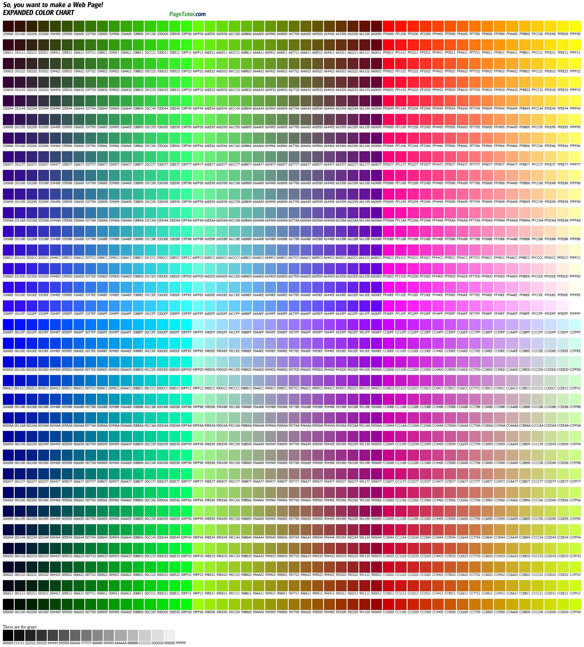
Each pixel in an image has a numerical value of between 0 and 255 and is made up of three color channels. Four colors and their RGB values can be seen below:

There are over 16 million possible combinations using this scheme and each one represents a different color. Computer savvy folks will know that each color is represented by a hexadecimal. Check them all out here.
Pixel Count
A megapixel is 1 million pixels and is abbreviated as MP, and cameras are reaching 80 MP (Leaf Aptus-ii) and growing. More pixels equal more post-photographing possibilities. You may not want to turn your photo into a billboard when you take it, but you never know if you might later.
Resolution
Resolution changes depending on purpose
Usee 72 PPI for digital and 300 PPI for Print
Resampling VS Re-sizing
You can think of the Pixel Dimensions section as the section you’d want to change if you were working on an image for the web or simply to display on your computer screen, while the Document Size section is used when you need to control how large your image will print.
Pixel Dimensions = web
Document Size = Print
Image resizing
keeps the number of pixels in your image the same and affects only how large
your image will print (the Document Size).
Image resampling
physically changes the number of pixels in your image (the Pixel Dimensions).
The Resample Image
option at the bottom of the Image Size dialog box controls whether you’re
resizing or resampling an image.
With Resample Image checked,
you’re resampling the image. With it unchecked,
you’re simply resizing the image.
Resampling images by changing the width and height values
in the Pixel Dimensions section of the Image Size dialog box is primarily used
when optimizing images for the web.
Resizing images by changing the width, height and/or
resolution values in the Document Size section of the Image Size dialog box is
used for print.
File Types
JPEG, TIFF, PNG, GIF, and RAW, and the wide world of file types
TIFF (also known as TIF), file types ending in .tif
TIFF stands for Tagged Image File Format.
TIFF images create very large file sizes. TIFF images are uncompressed and thus contain a lot of detailed image data (which is why the files are so big) TIFFs are also extremely flexible in terms of color (they can be grayscale, or CMYK for print, or RGB for web) and content (layers, image tags).
TIFF is the most common file type used in photo software (such as Photoshop), as well as page layout software (such as Quark and InDesign), again because a TIFF contains a lot of image data.
JPEG (also known as JPG), file types ending in .jpg
JPEG stands for Joint Photographic Experts Group
JPEG files are images that have been compressed to store a lot of information in a small-size file. Most digital cameras store photos in JPEG format, because then you can take more photos on one camera card than you can with other formats. A JPEG is compressed in a way that loses some of the image detail during the compression in order to make the file small (and thus called “lossy” compression).
JPEG files are usually used for photographs on the web, because they create a small file that is easily loaded on a web page and also looks good. JPEG files are bad for line drawings or logos or graphics, as the compression makes them look “bitmappy” (jagged lines instead of straight ones).
GIF, file types ending in .gif
GIF stands for Graphic Interchange Format.
This format compresses images but, as different from JPEG, the compression is lossless (no detail is lost in the compression, but the file can’t be made as small as a JPEG). GIFs also have an extremely limited color range suitable for the web but not for printing.
This format is never used for photography, because of the limited number of colors. GIFs can also be used for animations.
PNG, file types ending in .png
PNG stands for Portable Network Graphics.
It was created as an open format to replace GIF, because the patent for GIF was owned by one company and nobody else wanted to pay licensing fees. It also allows for a full range of color and better compression.
It’s used almost exclusively for web images, never for print images.
For photographs, PNG is not as good as JPEG, because it creates a larger file. But for images with some text, or line art, it’s better, because the images look less “bitmappy.” When you take a screenshot on your Mac, the resulting image is a PNG–probably because most screenshots are a mix of images and text.
Raw image files Raw image files contain data from a digital camera (usually).
The files are called raw because they haven’t been processed and therefore can’t be edited or printed yet.
There are a lot of different raw formats–each camera company often has its own proprietary format. Raw files usually contain a vast amount of data that is uncompressed. Because of this, the size of a raw file is extremely large.
Usually they are converted to TIFF before editing and color-correcting. Display, Printing, DPI and PPI
Review of Adobe
Bridge. Transferring photos from a camera. Workspaces in Bridge. Changing file
names and batch renaming, adding basic metadata with metadata templates,
creating and applying keywords to images.
Homework
Take 20 photographs of your favorite food in RAW format.
Shoot it as many ways as possible. Don't forget to have fun, get creative, and use your imagination. Think about composition, light, and location. Get familiar with your DSLR. Download the photographs and use the organization methods in Bridge from class. Rename all the photos and apply the Keyword WEEK1 to this set.
Please choose your 3 favorites to share with the class.
Subscribe to:
Posts (Atom)